Brahkest
patreon
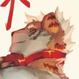
Been awhile since I did a process pic so here we goooo~
This one was a bunch of layers, way more than I usually have so I tried to condense it a bit otherwise we'd have like 40 steps lol. Still a bit long tho so enjoy if you have a read~
1) Sketchidoo. I don't usually plot out backgrounds but it ended up helping figure out both the rear trees and the foreground.
2) Unlike all my usual pics, the main char here was done on 2 layers then merged (line art + colors). So it ended up being way more painterly as I tested out some brushes, specifically ones that had a grass texture to make the hair and fur.
3) Turned off the char for now to start the background. Dark gradient base with several layers on top to create the snow and fog (which had the opacity cut by about 60%).
4) Additional background details added. Dark grayish layer for the snow on the trees - avoided stark white since, as part of the background, it shouldn't stand out too much.
5) Foreground added as their own layers on top of the char layer. Same brush from the bushes and trees was used here but at a softer, blurrier setting to make more out-of-focus foliage. Same dealio for the ribbon.
6) Lastly turned on the char layer. Duplicated the char, blurred it and placed that layer on top of the char. Turned down the opacity to around 25% for a slight softness effect and done~